Visual Studio 11 Beta
Posted by Filip Ekberg on 01 Mar 2012
Yesterday on February 29, Visual Studio 11 Beta was released and with it comes a beta version of .NET 4.5. You can download Visual Studio 11 Ultimate Beta from Microsofts website.
There has been some changes to the UI that has gotten a lot of attention the last couple of weeks, let's take a closer look at what we can expect from the Visual Studio 11 Beta.
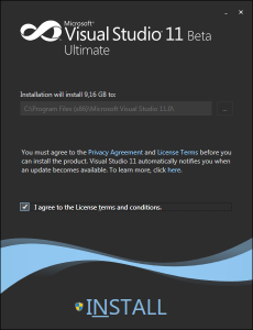
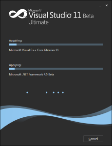
The first thing that we are faced with is the installer, all the installers for Visual Studio has in my opinion looked much better than any other installers and the installer for Visual Studio 11 Beta is the winner among them. It got a very nice look and feel over it and it's clear they've put some effort into the smallest details.
If you are installing Visual Studio 11 Beta with the Web Installer, it will take some time. Once the installation has finished fire up Visual Studio!
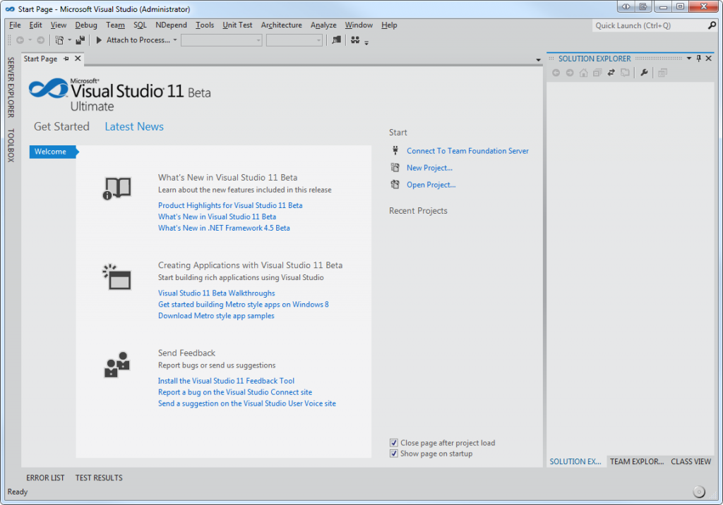
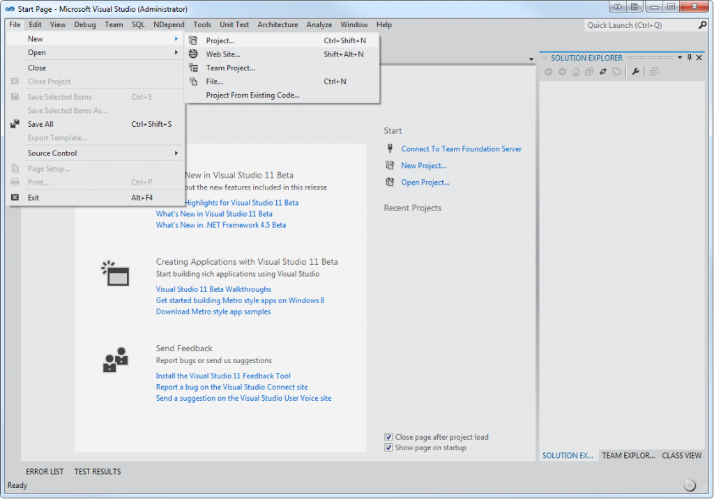
When the first screenshots of the Beta was released, many of the Visual Studio users were surprised of the monochrome interface. It's a quite drastic change compared to what we are used to in Visual Studio. Up until Visual Studio 2010 we've been comfortable with a lot of colors and nice icons.
Now, the workspace is in more focus.
The menus, icons, tabs and everything else in the interface just feels right. When you spend 8+ hours per day in Visual Studio, you want something that is easy on the eyes and that is exactly what this is.
Even the icons in the menu have a monochrome approach.
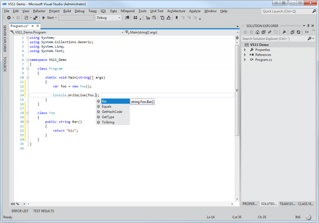
Let us take a look at how it looks and feels to write code, create a new console application.
When the project is created and you've got the Program.cs opened add some content to it to get a feeling of the studio.
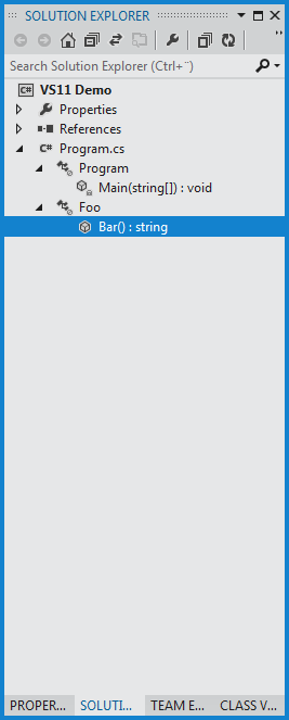
As you can see the code is in focus, nothing else is stealing your attention. The code coloring is what we are used to and the key mapping as well. Notice the Solution Explorer, there's an expand button for each file that will let you view classes, methods and properties in the file.
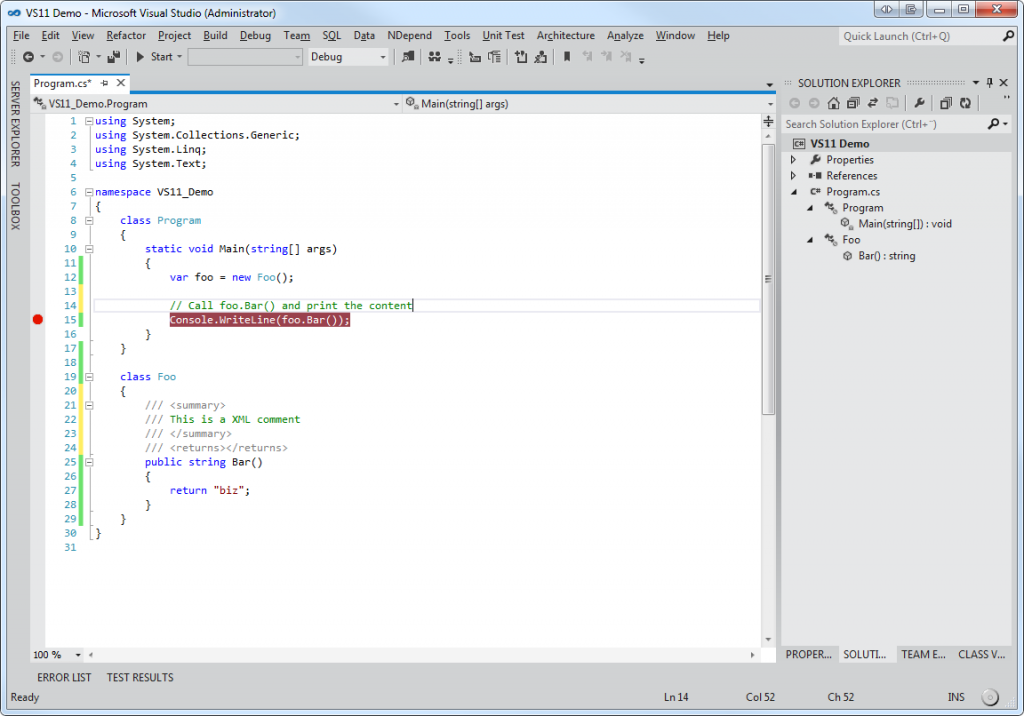
You attention is automatically going towards what is important, the code. Let's take a look at a last screenshot where it is more clear that the code, comments and breakpoints get your attention.
After you have tried Visual Studio 11, leave a comment and let me know what you think of it!

 Filip Ekberg is a Principal Consultant at fekberg AB in the country with all the polar bears, Microsoft C# MVP, author of a self-published C# programming book, Pluralsight author and overall in love with programming.


